Component
Feature Section
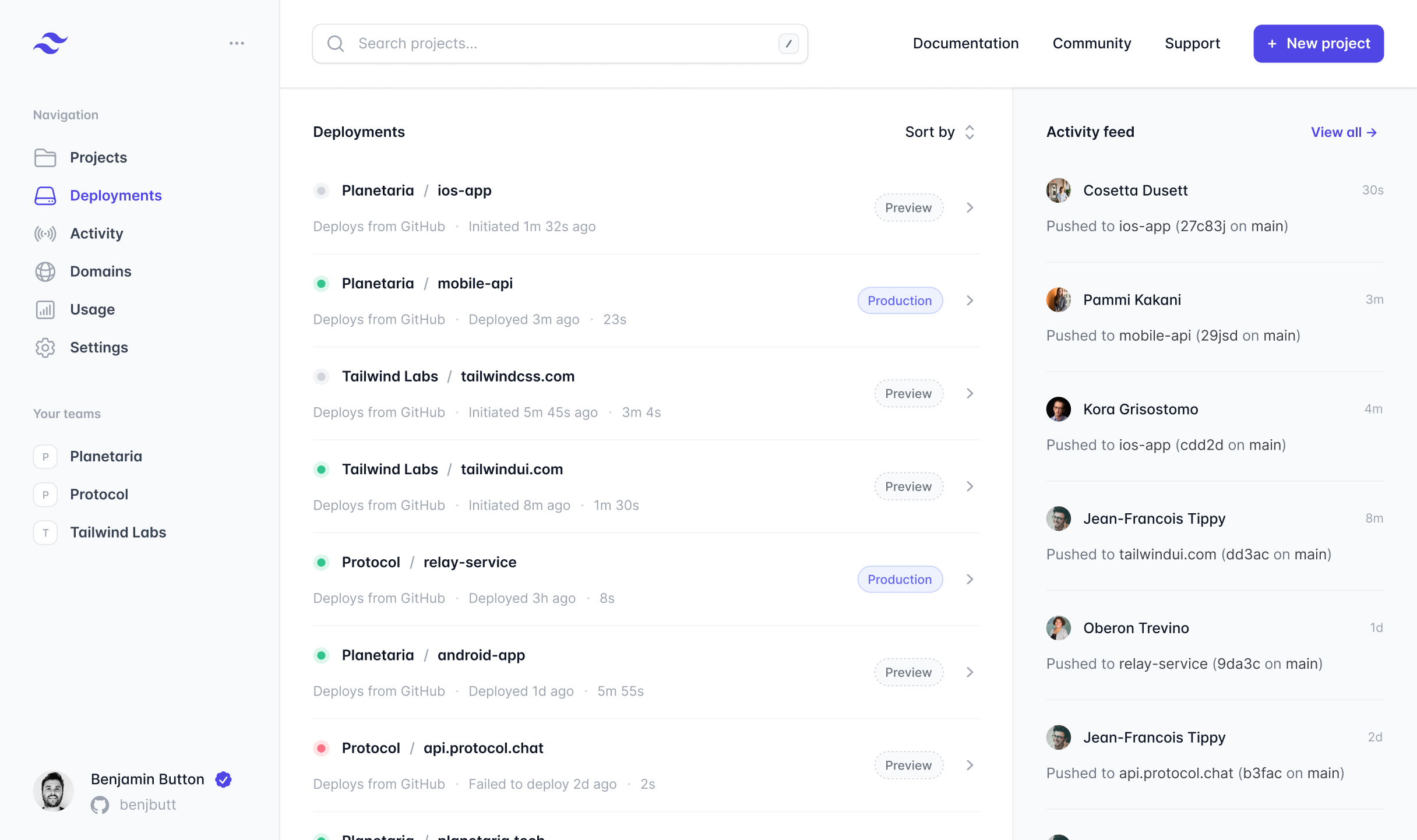
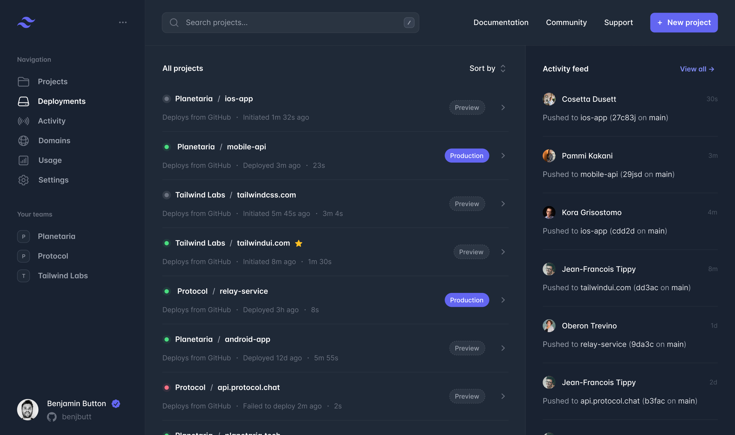
Two-column section — Cal Sans headline + inline feature list left, large screenshot right. Image bleeds off the right edge with a gradient fade. Supports light and dark themes.
Preview
Sanity fields
Available as featureSection in the Page builder.
| Prop | Type | Default | Description |
|---|---|---|---|
| headline | string | — | Required. Cal Sans display headline. |
| eyebrow | string | — | Optional mono-caps label above the headline. |
| body | text | — | Optional body copy below the headline. |
| features | array | [] | Feature rows: { icon, title, body }. Icon is a Lucide key (upload, lock, server…). |
| image | image | — | Screenshot or product image. Displayed oversized, fading off the right edge. |
| theme | "light" | "dark" | "light" | Section colour scheme. |
Usage
tsx
import { FeatureSection } from '@/components/sections/feature-section'

<FeatureSection
  block={{
    _type:    'featureSection',
    theme:    'light',
    eyebrow:  'True North Platform',
    headline: 'A better workflow',
    body:     'Everything you need to publish, protect, and share your photography.',
    features: [
      { icon: 'upload', title: 'Push to deploy.',        body: 'Publish instantly.' },
      { icon: 'lock',   title: 'Password protection.',   body: 'Gate with a single password.' },
      { icon: 'server', title: 'Edge-cached delivery.',  body: 'Served from the nearest edge.' },
    ],
    image: { /* Sanity image object */ },
  }}
/>
tsx
// Via Sanity BlockRenderer — no extra code needed.
// Add to a Page document in Studio:
// Sections → Add item → Feature Section